
Published On Jun 16, 2019
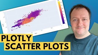
In this video, we will be learning how to create scatter plots in Matplotlib.
This video is sponsored by Brilliant. Go to https://brilliant.org/cms to sign up for free. Be one of the first 200 people to sign up with this link and get 20% off your premium subscription.
In this Python Programming video, we will be learning how to create scatter plots in Matplotlib. Scatter plots are great for determining whether two sets of data are correlated. If there is a correlation, scatter plots allow us to spot these trends. Let's get started...
The code from this video (with added logging) can be found at:
http://bit.ly/Matplotlib-07
Matplotlib Marker Styles - http://bit.ly/Matplotlib-Fmt-Str
Matplotlib Colormaps - https://matplotlib.org/3.1.0/tutorial...
✅ Support My Channel Through Patreon:
/ coreyms
✅ Become a Channel Member:
/ @coreyms
✅ One-Time Contribution Through PayPal:
https://goo.gl/649HFY
✅ Cryptocurrency Donations:
Bitcoin Wallet - 3MPH8oY2EAgbLVy7RBMinwcBntggi7qeG3
Ethereum Wallet - 0x151649418616068fB46C3598083817101d3bCD33
Litecoin Wallet - MPvEBY5fxGkmPQgocfJbxP6EmTo5UUXMot
✅ Corey's Public Amazon Wishlist
http://a.co/inIyro1
✅ Equipment I Use and Books I Recommend:
https://www.amazon.com/shop/coreyschafer
▶️ You Can Find Me On:
My Website - http://coreyms.com/
My Second Channel - / coreymschafer
Facebook - / coreymschafer
Twitter - / coreymschafer
Instagram - / coreymschafer
#Python #Matplotlib