Published On Premiered Jun 14, 2022
▬▬▬▬▬▬▬▬▬ஜ۩۞۩ஜ▬▬▬▬▬▬▬▬
▓▓▓▒▒░░ Open This Description ░░▒▒▓▓▓
▬▬▬▬▬▬▬▬▬ஜ۩۞۩ஜ▬▬▬▬▬▬▬▬
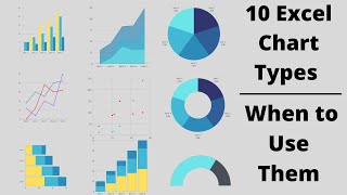
How To Make a Line Chart In Excel
In this video, I show you how to make a line graph in Excel. It's a really simple process, and you can turn any data into a nice-looking line graph. If you want to use your data for a presentation, then you can use this tutorial to create a line graph to impress your audience. A line graph will turn the data into an easy-to-read image that you can use to represent the data in your excel spreadsheet!
Cricket Run Comparison Line Chart in Microsoft Excel
What is a Line Chart?
line chart is a graph that shows a series of data points connected by straight lines.
It is a graphical object used to represent the data in your Excel spreadsheet.
You can use a line chart when:
You want to show a trend over time (such as days, months or years). In this case, the time values would be your categories.
The order of your categories (ie: time values) is important.
Steps to Create a Line Chart
To create a line chart in Excel 2016, you will need to do the following steps:
1. Highlight the data that you would like to use for the line chart. In this example, we have selected the range A1:D7.
2. Select the Insert tab in the toolbar at the top of the screen. Click on the Line Chart button Microsoft Excel in the Charts group and then select a chart from the drop down menu. In this example, we have selected the fourth line chart (called Line with Markers) in the 2-D Line section.
3. Now you will see the line chart appear in your spreadsheet showing the trend for 3 products (ie: Desktops, Laptops and Tablets). The blue series of data points represents the trend for Desktops, the orange series of data points represents Laptops and the gray series of data points represents Tablets.
The axis values for each product are displayed on the left side of the graph.
4. Finally, let's update the title for the line chart.
To change the title, click on "Chart Title" at the top of the graph object. You should see the title become editable. Enter the text that you would like to see as the title. In this tutorial, we have entered "Product Trends by Month" as the title for the line chart.
Congratulations, you have finished creating your first line chart in Excel 2016!
LIKE | COMMENT | SHARE | SUBSCRIBE
अगर आप को यह विडियो पसंद आया तो कृपया लाइक करें और अगर आप कुछ कहना या पूछना चाहते है तो कृपया नीचे दिए गए कमेंट बॉक्स में लिखें !
ComTutor हिन्दी युटूब चैनल है जो आपको इन्टरनेट, कम्प्यूटर, मोबाईल और नयी टेकनालाजी के बारे में हिन्दी में जानकारी देता है।
आप हमारे चैनल को Subscribe करे।
/ @comtutor
फेसबुक पर पसंद करने के लिए क्लिक करें
/ comtutor4u
ट्विटर पर फॉलो करने के लिए क्लिक करे
/ comtutor4u