Published On Oct 29, 2023
Make McKinsey Charts and Visuals in Excel from scratch.
🚀 Take our PowerPoint Course: https://www.careerprinciples.com/cour...
🆓 DOWNLOAD Free Excel file for this video: https://careerprinciples.myflodesk.co...
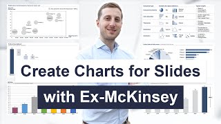
In this video, I make 3 McKinsey visuals in Excel. McKinsey & Company is the most prestigious consulting firm in the world, so they're known to make some of the best visuals in the industry. That’s why I want to show you how to replicate three of their most popular visuals, in Excel. First, we create a radial bar chart, which is like a mix of a pie chart and a bar chart. You can find this inside of the pie charts section in Excel. Specifically, next to a doughnut chart. Second, we make a bar chart to compare one column of numbers inside of the other. This is similar to a budget vs actuals chart. Lastly, we make a stacked bar chart to showcase the demographics in each step of the corporate ladder.
LEARN:
🔥Power BI for Business Analytics: https://www.careerprinciples.com/cour...
📈 The Complete Finance & Valuation Course: https://www.careerprinciples.com/cour...
👉 Excel for Business & Finance Course: https://www.careerprinciples.com/cour...
🚀 All our courses: https://www.careerprinciples.com/courses
SOCIALS:
📸 Instagram - https://www.instagram.com/careerprinc...
🤳 TikTok - / career_principles
🧑💻 LinkedIn - / careerprinciples
▬▬▬▬▬▬▬▬▬▬▬▬▬▬▬▬▬▬▬▬▬▬▬▬▬▬▬▬▬▬▬▬▬▬▬▬▬▬▬▬
Chapters:
0:00 - Radial Bar Chart Part 1
3:05 - Eyedropper Trick
4:07 - Radia Bar Chart Part 2
6:33 - Unnamed Bar Chart?
12:02 - Stacked Bar Chart
This video is for educational purposes only. Find out more about the charts used here: https://www.mckinsey.com/featured-ins...