Published On Oct 29, 2023
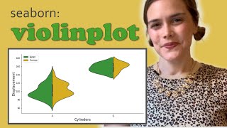
A violin plot is a method of plotting numeric data and can be understood as a combination of a box plot and a kernel density plot. It provides a visualization of data distribution.
But how do we interpret a violin plot?
Kernel Density Estimation:
This is the outer layer of the violin plot and displays the density of the data at different values. The width of the plot at different values indicates the density of the data: a wider section suggests a higher density (more data points), whereas a narrower section indicates lower density (fewer data points). The violin plot is typically symmetrical, meaning it mirrors the density estimation on either side of its axis.
Central Box Plot which is Optional:
Inside the violin, there is often a miniature box plot which provides additional details about the data's distribution. The central line in this box plot represents the median of the data, while the edges of the box represent the interquartile range, giving insights into the data's spread.
Whiskers which are Optional:
Like in a box plot, whiskers might extend from the box, indicating variability outside the upper and lower quartiles. They can provide a visual cue for identifying outliers.
► Make a Violin Plot online
https://datatab.net/statistics-calcul...
► E-BOOK
https://datatab.net/statistics-book