Published On Dec 29, 2018
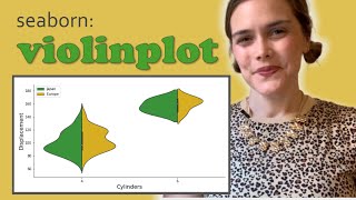
Violin plots are similar to box plots, except that they also show the probability density of the data at different values, usually smoothed by a kernel density estimator. This tutorial will help you interpret a violin plot using the seaborn library.
Link to the notebook :
https://github.com/bhattbhavesh91/vio...
If you do have any questions with what we covered in this video then feel free to ask in the comment section below & I'll do my best to answer those.
If you enjoy these tutorials & would like to support them then the easiest way is to simply like the video & give it a thumbs up & also it's a huge help to share these videos with anyone who you think would find them useful.
Please consider clicking the SUBSCRIBE button to be notified for future videos & thank you all for watching.
You can find me on:
Blog - http://bhattbhavesh91.github.io
Twitter - / _bhaveshbhatt
GitHub - https://github.com/bhattbhavesh91
Medium - / bhattbhavesh91
#ViolinPlot #Seaborn #Visualization