Published On Feb 13, 2020
001 A summary of Data and Statistic • 001 Data and Statistic - What are dat...
002 Types of data • 002 Types of data. Attributes and Var...
03 The important of graphs for analyzing data • 003 Using graphs to analyze data. Why...
004 Bar charts, Pareto charts and Pie charts • 004 Bar charts, Pareto charts and Pie...
005 Histogram and Dot plots • 005 Histogram and Dot plots |Lean Six...
Create Histogram with Normal curve overlay in Excel • How to Create a Histogram with Normal...
006 Individual Value Plots • 006 Individual Value Plots |Lean Six ...
007 Box plots • 007 Box plots - What Why When and How...
008. Time Series Plots • 008 Time Series Plots - What When Why...
Critical to quality • Critical to quality VOC to CTQs lean ...
What is Voice of Customer(VOC) • Voice of Customer(VOC)-Critical to Qu...
Why lean? What is lean? • Why lean? What is lean? full explanat...
Why six sigma? What is six sigma? • Why six sigma? What is six sigma?
Six Sigma Certification Tollgate Checklist • Six Sigma Certification Tollgate Chec...
Process Capability, Capability indices, Cpk vs. Ppk, Capability Sixpack analysis • Process Capability, Capability indice...
Conduct normality test with Excel • Normality test - calculating p-value ...
Calculate StDev(Within), StDev(Overall) , Cp, Cpk using MS Excel • Subgroup greater than 1 Calculating S...
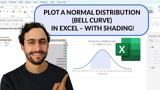
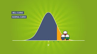
Create Normal Curve - Distribution plot - Bell Curve - Normal Distribution graph in Excel in 5 steps • How to Create a Normal Curve - Distri...