Published On Jan 23, 2021
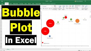
In this video, you will learn how to create bubble chart from multiple data series or multiple data sets. A bubble chart is a variation of a scatter chart in which the data points are replaced with bubbles, and an additional dimension of the data is represented in the size of the bubbles. A bubble chart is a type of chart that displays three dimensions (three variables) of data. You can easily Create a Bubble Chart with Multiple Data Series or using two data sets. You can easily conditionally format bubble chart (edit axis label or values, change the color and size of bubble and chart title ) by following simple instructions which are given in this video. I have used Microsoft Excel 2016 to Create a Bubble Chart with Multiple Data Series. You can use other versions of excel such as excel 2010, excel 2013, excel 365 and excel 2019 to Create a Bubble Chart with Multiple Data Series.
#bubblechart #multipledataseries #excel #twodatasets #teachingjunction
Watch other YouTube video tutorials on Excel:
Create a Bubble Chart with 3 Variables in Excel: • Create a Bubble Chart with 3 Variable...
Creating an XY Scatter Plot in Excel: • Creating an XY Scatter Plot in Excel ...
Scatter Plot for Multiple Data Sets in Excel: • Scatter Plot for Multiple Data Sets i...
How to change vertical Axis Values in Excel (Line chart): • How to Change the Vertical Axis (y-ax...
Other YouTube queries:
Create a Bubble Chart with Multiple Series of Data,
Create a Bubble Chart,
Bubble Chart with 3 Variables in Excel,
How To Create A Bubble Plot In Excel (With Labels!),
How to Make a Bubble Chart in Excel 2016,
How to Create a Bubble Chart in Excel,