Published On Dec 15, 2022
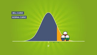
In Microsoft Excel, superimposing or overlaying a histogram with the normal distribution or bell curve (Gaussian) in a diagram is not easy.
In this lesson, an example will show how to do this for the same dataset.
The scatter xy diagram is used for this.
This has the option of adding a secondary axis (second y-axis) and error indicators.
With this knowledge, you then have a reasonable basis for visually comparing the distribution of values in a histogram with the normal distribution.
I wish you much success.
Rolf Ihde
show more